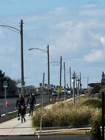
The new parking signs look terrible and are no different than an


AdBlock Detected!
Thank you for reading & participating.
Spout Off is funded by advertising.
Please disable or pause your ad blocker to continue.
Cape May - The new parking signs look terrible and are no different than any other city. The old parking meters are unique and fit perfectly into the aesthetics of Cape May. Put the meters back please. Bring back our historic look.
Print Publication Date:
4/17/2024

